Battle Map Art Styles: Finding the Right Look for Your Campaign
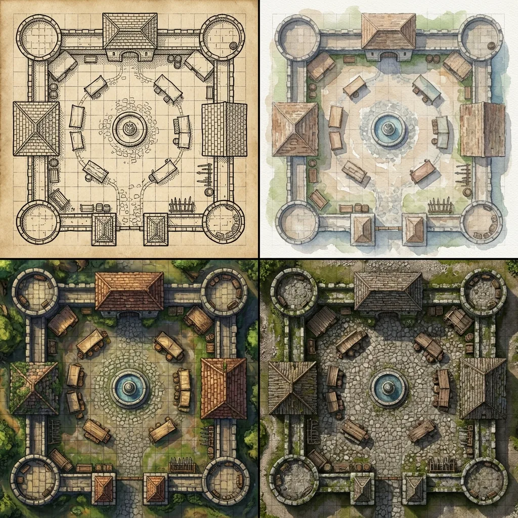
Choosing between battle map art styles is one of the most underrated decisions a Game Master makes. The same castle courtyard reads completely differently as stark ink on parchment, as a soft watercolor sketch, or as a photorealistic aerial shot, and each version quietly tells your players what kind of game they are sitting down to. A grimdark survival crawl played on cheerful storybook maps fights its own table dressing all night. Yet most map searches focus entirely on subject matter, with style left to whatever the generator felt like producing that day.
With AI generation, style is not something you inherit from an asset pack; it is a phrase you type. In this guide, we will walk through seven distinct battle map art styles, what each one evokes, which campaigns it suits, and the exact prompt modifier that produces it. We will then cover how to match style to system and tone, and how to keep a consistent look across an entire campaign.
Style is a promise to your players
Before the gallery, one principle worth internalizing: the art style of your map is a tone promise. Players calibrate their expectations from what they see. Clean, bright, painterly maps promise heroic fantasy where clever plans work. Muddy, high-contrast maps with pooled shadows promise attrition and dread. Blueprint-style line work promises old-school procedural play where the map is information, not scenery. None of these promises is better than the others, but breaking one is jarring, so pick the style that matches the game you intend to run. As we explain in our guide to the perfect AI map prompt, the style modifier belongs at the end of your prompt, after the subject and lighting descriptors, and it is the part you should change least often.
1. Hand-drawn ink and parchment
This is the oldest look in the hobby: confident black line work, crosshatched shadows, and the warm tone of aged paper. It evokes ship logs, explorer journals, and the dungeon maps of early published modules. It suits OSR campaigns, hexcrawls, pirate games, and any table that likes maps to feel like documents the characters could actually be holding. Because the style strips away color detail, it also prints beautifully in black and white.
- The modifier: "black ink line art on aged parchment, crosshatched shading"
- Example: "Top-down battle map of a castle courtyard, cobblestone paving, central well, wooden siege scaffolding along one wall, black ink line art on aged parchment, crosshatched shading, gridless."
2. Classic watercolor
Watercolor maps have soft edges, translucent color washes, and visible paper texture. The style evokes storybooks and gentle wilderness, which makes it a natural fit for whimsical campaigns, fey adventures, low-violence family tables, and pastoral travel montages. It is also forgiving: watercolor hides the small object-level oddities that AI generation sometimes produces, because the whole image reads as impressionistic.
- The modifier: "soft watercolor painting, visible paper texture, muted earth tones"
3. Painterly digital fantasy
This is the modern default: rich saturated color, soft global lighting, and rendered detail on every barrel and flagstone. It is the style most players picture when they hear "battle map," and it is the house look of most virtual tabletop content. It suits mainstream heroic fantasy in any system, and it is the safest choice when your party spans casual and hardcore players. If you want inspiration for what this style does with dramatic terrain, our tour of fantasy battle map environments leans on it heavily.
- The modifier: "highly detailed painterly digital fantasy art, rich colors, soft ambient lighting"
4. Photorealistic terrain
Photorealistic maps look like drone photography: real grass, real mud, real stone. The style evokes modern and historical settings, gritty low-magic fantasy, and military campaigns where players think in sightlines and cover rather than spectacle. It is the strongest choice for zombie survival, espionage, and World War-era games, where a painterly goblin-market aesthetic would break the fiction instantly. Be aware that photorealism is unforgiving of scale mistakes, so keep your prompts specific about object sizes.
- The modifier: "photorealistic aerial photography, natural textures, overcast daylight"
5. Grimdark high-contrast
Grimdark style is defined less by what is drawn than by what is lit. Expect a muted, desaturated palette, deep pooled shadows, and small islands of warm torchlight surrounded by darkness. It evokes dread, scarcity, and the sense that the environment itself is hostile, which makes it the signature look for horror one-shots and lethal old-school crawls. We built an entire prompt collection around this aesthetic in our Shadowdark dungeon map guide if you want twelve ready-made examples.
- The modifier: "muted palette, deep shadows, torchlight"
6. Retro blue old-school module style
The nostalgic blueprint look: crisp white or light-blue line work on a deep blue field, rooms as clean geometry rather than rendered scenery. It evokes classic module cartography and treats the map as pure information, which suits procedural dungeon crawls, theater-of-the-mind tables that only need spatial reference, and anyone chasing that old-school cool. One note for Text to Tabletop users: the generator strips printed grid lines automatically so your VTT can overlay its own, so prompt for the blueprint aesthetic itself rather than asking for a drawn grid.
- The modifier: "vintage blueprint style, clean white line work on deep blue background"
7. Clean sci-fi deckplan
Starship corridors, research stations, and colony domes call for flat metallic panels, cool white lighting, and thin glowing accent lines. The style evokes sterile technology and suits Traveller, Starfinder, and horror-in-space games, where the cleanliness itself becomes unsettling the moment something breaches it. Keep the palette to two or three colors and let a single accent hue, amber warning strips or blue holo-panels, carry the character.
- The modifier: "clean sci-fi deckplan style, flat metallic panels, cool white lighting, thin glowing accent lines"
Matching style to system and tone
A quick pairing guide when you are unsure: heroic fantasy systems default to painterly digital; OSR and rules-light retro systems shine with ink-and-parchment or blueprint styles; horror wants grimdark contrast regardless of system; modern-day settings almost always want photorealism; and science fiction wants deckplans indoors but photorealistic terrain for planetside encounters. Tone can override system. A political intrigue arc in a heroic fantasy campaign might drop into muted grimdark for one assassination-in-the-dark session, and that visual shift alone tells your players the stakes have changed before a single word of narration.
Keeping one style across a whole campaign
Consistency is where most AI-generated campaigns fall apart visually, and the fix is procedural, not artistic. First, treat your style modifier as a fixed suffix: write it once, save it, and paste the identical phrase at the end of every map prompt for the campaign. Changing even a few words of the style clause invites drift. Second, when a map is almost right, do not regenerate the whole image, because a full reroll rerolls the style rendering along with the content. Text to Tabletop's area regeneration lets you select just the problem region and regenerate it while the rest of the map, and its established look, stays untouched. Third, generate related locations in one sitting when you can; a consistent prompt plus a consistent session of generation produces a set that hangs together like a commissioned pack.
Pick a look and commit
The best battle map art style is the one your table stops noticing, because it matches the story so well that it reads as simply what the world looks like. Choose one of the seven modifiers above, staple it to the end of every prompt, and let the AI battle map generator hold the style steady while you focus on encounter design. When you are ready to see your campaign in its own signature look, sign up for the Text to Tabletop app today and start generating custom maps in seconds.
Tyler V
Lead Developer and UX Designer at Text to Tabletop. Passionate about helping GMs and players create better TTRPG experiences.
Ready to Forge Your Next Battle Map?
Describe the encounter and get a grid-aligned, top-down battle map in seconds, then regenerate any area until it matches your vision.
Generate Your First Map Free3 free map tokens · no credit card required